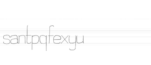
Sans-serif typeface in five weights: Thin, Regular, Bold, Bold Alternate & Extra-Bold. Created in Glyphs Mini 2. Partly inspired by DIN & Helvetica Extra Bold.
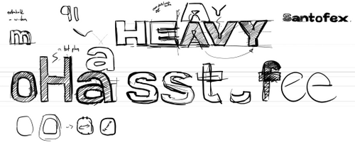
Santofex started as a typeface inspired by DIN, as I wanted to create something that was tall and legible. The first sketches were done in Procreate, then used as reference for a rough pass in Glyphs Mini 2. In the iteration and experimentation process, the character of the type changed into something slightly more humanist.


Key distinctions involve 5°cuts, increments, & tilts the shape of many character strokes, especially in the lowercase 'o'.
After the initial sketches, vectors were created in Glyphs Mini 2, following the intial bold sketches. Some details were dropped, such as the diagonal cuts on the ascenders and descenders. As more letters were created, the font began to take form around the shape of the 'o'. This initial set of characters was created with pinches at the lower parts of letters, which provided a distinct shape to each vertical stem. However, when the typeface was started anew, the pinch was dropped in favour of a more readable style.
From there, the Thin weight was done first, using wirey lines. Normal shares most of the same curves with the Thin weight, just with minor variations in curve and wider sidebearings and kerning. Bold introduced more varied shapes, such as the curve by the opening of the 'e'. Extra bold had the most variation.

When the extra bold weight was started, I noticed that it lacked contrast and whitespace, necessitating some more significant changes to the lettershapes to keep it readable.
Once the first pass of shapes of the characters were finished, sidebearings and kerning was adjusted. Common accent symbols and their respective accented characters were also created during this time. Testing the font on sample work and this website showed that the spacing of the font was too tight, and the letters were not always readable. They were adjusted to be wider, and letter shapes were refined further as they were tested.


