Carleton School of Industrial Design capstone project to redesign the crossings on the Hartwells Locks in partnership with the National Capital Commision and Parks Canada.

My studio group was each tasked with designing a crossing for the Hartwells Locks on the Rideau Canal, located adjacent to Carleton University. The task was to create a crossing that did not violate its status as a UNESCO World Heritage site. In short, we had to design something that was new, yet historical, at the same time, something we would figure out through research. In the meantime, we explored some early ideas in answer to the prompt.
One idea I liked in particular was that of an underpass/public park hybrid. By creating a reinforced tunnel underneath the canal, a crossing could be created that left canal operations unaffected, and could create a public space for people to gather under and take shelter from. However, I went a different direction due to initial feedback and urge to create a solution closer to the initial prompt.
How does one create an innovative yet historically respectful crossing?

In this phase, we did competitive analyses, conducted observations, and plotted our design directions out on charts. A review of our observations and a questionnaire helped us identify our main stakeholders. Position charts, competitive analysis, Mandela charts, and other frameworks were used to organize and break down our design ideas, and lead ideation into more varied areas.
Art styles were explored too, looking at historic Canadian architectural styles such as the Gothic Revival used throughout the Parliament buildings; but these seemed creatively restrictive and backwards (if not a bit colonial). More thinking would be done on this.
Observations

Survey Answer Examples
"...the lock gates are very low... I am concerned about slipping and falling..."
"There is pretty much NO LIGHT here at night... "
"You get a better view with the height [on a bridge], it also feels more safe and secure..."
“Make it feel safer, when I cross and the wood is wet I am concerned about slipping and falling. Also the stairs at the end of the lock is too steep.”
Observations
Stakeholders
Passerbys
Commuters
Exercisers
Local & Leisure
Tourists
Sightseers
Casuals
Transportation
Cyclists
Wheelchairs
Boats
A survey was created in order to gain some feedback on different aspects of the existing Canal crossings that people like and dislike. Some of the most promiment concerns included: the lack of security with the low — historically accurate — railings, the narrow width of the crossing, inaccessible steps, lack of lighting, and more. These were functional aspects we would have to address in our designs in addition to its historic & emotional appeal.
Further concepts were made solve these issues; some more rational, some blue sky explorations. The underpass idea was developed further once more but was discarded for a solution that kept closer to the original prompt.
The rails of the crossing are low and do not adhere to current day safety standards as a holdover from the original locks. The existing crossings on the locks are widened from their historic width.

A summary of the last semester progress into a physical report. Similar to the second presentation, compiled into a letter sized report format.

On the poster above is a summary of all the research that was done in the first semester. All of the previous information, questions, and directives rethought and consolidated into the final 3 goals for the project.
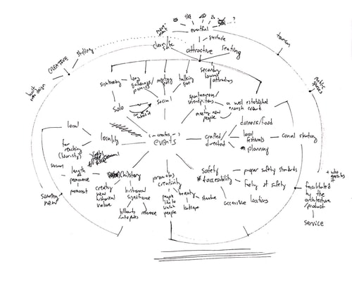
How do we create events?
This was started by reframing the goal of the project into the above question. Thus, some brainstorming occured...

After reframing the question and reanalyzing our stakeholders & prompt further, I realized that the historical element can be alluded to and not just repeated like before. Importantly, the design of the crossing would not affect its UNESCO World Heritage designation so long as the canal works — allowing for more liberal directions for designs.
The crossing will be a novel piece of public art/architecture which will be used to facilitate events.
At which point, we can arrive at the new design goals. The crossing must function as well as a crossing and provide accessible route on the canal. It must give joy to the user as part of a public space. And lastly it must add value in all ways to the area, becoming part of its history.
Movement & Access
Afford an accessible pathway that opens for water traffic
Interactive & Delightful
Spark joy & delight in users via interaction to encourage gathering
Environmental Fit
Add value to the area aesthetically, culturally, & environmentally

The four directions were given a pass with more atmospheric concept art to explore each design's emotional character as a structure in situ. Although the design hews more conservatively, the Accordion was chosen for its relative simplicity and harkback look.

Final design direction for the crossing. The design of the crossing is a contemporary take on the existing crossings, but with an added movement. The new design gets rid of the bend that users would get caught up on, and widens the path to allow for opposing lanes of traffic. The pathway sits flush or near-flush with the rest of the ground for easy access for all individuals.

Movement Mechanism
The bridge folds up into an accordion, driven by a strong hydraulic piston on one side of the crossing, moving linearly in a scissor action. Guide Rails & Carriages guide the expansion and contraction movement. PTFE (Teflon) is used as a solid lubricant due to its durability and stands up to the elements.At full extension, the walkway rests on the movement to lock the mechanism in place. When closed, the walkway also slides onto shore to give room to water traffic.


Materials & Touchpoints
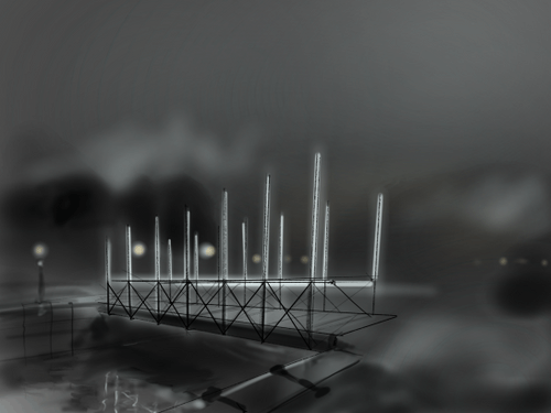
The walkway is made of a specially treated wood to call back to the existing crossings at Hartwells Locks and elicit feelings of warmth while remaining durable to the elements. Stainless steel handrails add a sense of stability and cleanliness to the crossing design. Lights are tall and illuminate the pathway as well as its surroundings.


Accessibility & Safety
An inset path & handrails provide accessible entries and navigation of the pathway. The path is over twice wide for easy access for opposing traffic. Meanwhile, the light poles create a well- lit path for an area that currently lacks light.
Emotional Impact
LED Lighting shines inwards to provide a light while the wood adds warmth. Tall, floating light beams envelop the user in light and airiness. The tall neutral-colour beams also add a contemporary chicness to the design. The crossing is designed as a contemporary adaptation of the current crossing design, to call back to its history while belonging to the current era. Sensors placed under the guard rails can detect a user's proximity, increasing the brightness of the beam its connected to when someone gets closer to it.

Tying the project together across its different stages, a design language was created for, and evolved with, the project. The same grid was used for all presentations. Each stage of the project brought something new to the design language.
Title pages were inspired by the surface of the water from the canal and the flowing patterns of water transfer graphics. These titles flow off the sides of their slides, adding some more organic, abstract movement to the composition. The negative & positive spaces of the characters create textures analogous to that of water rippling on the surface of water. Small boats are used as props on the surface of the water and interacting with the environment.
Colours for the project were cool and simple in keeping with the water theme. The beginning of the project had cooler, simpler colour schemes that became more complicated as the project went on. From teal, to deep icey blue, then blue and yellow, then finally leaning warm in black & yellow for the final colour scheme. This reflected the increasing definition and complexity of the project.
